Technical Analysis Charts
Although technical analysis charts are very simple to use, there are some things to be careful about when interpreting the story the chart is telling to you.
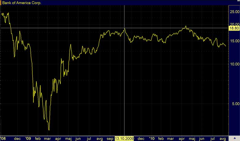
Technical analysis charts are graphical representation of security price movement over a specific time frame. Chart may show the movement of stock price over 1 year period, where every single point on the graph represents the closing price of that day�s trading session for example.
Most of technical analysis charts have two axes, the horizontal one (x-axis) representing time scale and the vertical one (y-axis) representing security price. By looking at a specific price point in the chart, you can read the exact historical price and time when this price was reached.
Each data point on the chart can represent different values; most commonly it is the closing price of the period, but it can be the open, high or low of the period as well.
Technical Analysis Charts Properties
There are few things to consider regarding the time scale, price scale and price point properties when interpreting the information from charts.

The Time Scale of Technical Analysis Charts
The time scale on the horizontal x-axis refers to range of dates, and can vary from years to seconds. Usually the default chart setup is representing daily time scale, and then every trader or investor can customize it based on its own needs; for example, short-term traders, intraday traders and scalpers will change the time scale to intraday values, like 15 minutes for example, while long term investors are more interested in analyzing long term charts, therefore extending the time scale to annually for example. Shorter time frames offer more details on what was going on in the market that time, while longer time frames tell you more the general story with fewer specifics.
Intraday charts, which are mostly used by day traders and scalpers, present the movement of the security within the period of one trading day. The time scale can range from market open to market close or it can go in more detail, such as 5 minutes.
In daily charts every data point represents movement of stock price in the trading day, which can be done by plotting one single piece of data like close value, or it can plot open, high, low, close data in a form of bars or candles. Daily charts can be spread over weekly, monthly or even yearly time scale, depending on the type of trend (short, medium or long term trend) you wish to analyze.
Weekly and monthly charts are used explicitly for determining long term stock market trend. These charts are similar to daily charts, only that they represent movement of stock price in a longer period, week for example. When looking at weekly chart where closing prices are plotted, each data point represents the last price at which the stock was traded on the last day of the week (usually Friday).
The Price Scale of Technical Analysis Charts
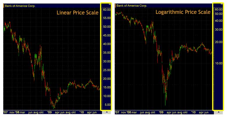
Like already mentioned, the price scale lies on the vertical axis, could be on the left or the right side of the chart. The purpose of price scale is to show you the current (last) stock price, as well as historical prices. Lower prices are at the bottom of the chart, while higher prices are plotted on the upper part. The concept is pretty simple, but there is one specific to be careful about - price scale can be constructed in linear or logarithmic way.

The default price scale is linear which means that there is equal space distance between different price levels - for example, there is the same distance among $10, $11, $12, and so on. In this case price moves are measured in absolute terms, that is why a move from $10 to $20 is visible the same as a move from $40 to $50.
Another option for price scale is logarithmic which is measuring price moves in relative (percentage) terms. A stock price move from $10 to $20 is 100%, while a move from $40 to $50 is only 25% change; on logarithmic price scale 100% move is not the same as 25% move - 100% move is represented by a larger space on the chart than smaller 25% change.
Recommended Reading - Recommended Reading - Recommended Reading - Recommended Reading
Back To Technical Stock Analysis Index...
Next step: Types of stock market charts...
Written by: Goran Dolenc
Do you find this content useful? Like! Tweet! Recommend! Share!
Back from Technical Analysis Charts to Investing in Stock Market
Back from Technical Analysis Charts to Best Online Trading Site for Beginners home page


