Point and Figure Charts Explanation
Point and figure charts are useful technical analysis tool used by advanced investors to help them determine buy and sell signals.
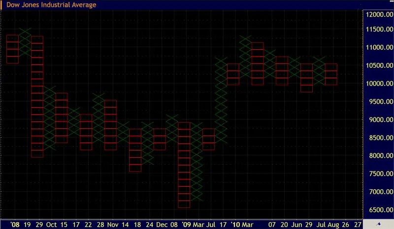
The point and figure technical analysis chart (also known as P&F chart) is not so often used among average investors like line, bar or candlestick charts, but it has a long history of use and some specifics make this type of chart a useful investing tool. Unlike other stock market chart types, the point and figure chart simply reflects price movements of the stock, while it removes the noise (insignificant price movement) and is not concerned with time and volume.
P&F charts are designed for long-term investment, however you can change the sensitivity of the P&F chart and make it more responsive to short-term trends by reducing the unit size of the price.
Construction of the P&F Chart
The key of P&F chart is the 'unit of price' plotted on the graph. Point and figure charts consist of alternating columns of X's (X) and O's (O). X represents a rising stock price, while O represents a downward stock price movement. These points appear on the chart only if the price moved for at least one unit up or down. You are the one who sets the unit price; it could be $0.50, $1, $2 or whatever number, depending on the nominal value of the stock.
The P&F charts only have the Y-axis, where the price scale is plotted, while on the x-axis you will find the timeline of months and years, giving the investor the idea of the date. While other conventional stock market charts focus on OHLC data points, the P&F chart is similar to line chart in focusing on the closing price only.

If the stock price moves up one price unit three days in a row, this would appear as three X's in the same column. When the trend reverses a new column of O's is plotted - one O for every price unit. X's and O's are always plotted in separate columns; however, the chartist must determine how many price units of opposite trend movement are required to begin a new column - most commonly three units.
If the stock is trading at $30 and you are using a $1 unit measurement and a three units reversal box, than a raise in stock price from $24 to $30 is marked with six X. The stock would have to fall to $27 to reverse back to column of O's, but since each unit of price movement must be plotted, O's would start to plot from $29 downwards. If the stock price would fall to $25, next reversal to columns of X's would appear at $28 close.
- $30 X
- $29 XO
- $28 XO
- $27 XO
- $26 X
- $25 X
- $24 X
Determining the Entry and Exit Points with P&F Charts
It is very simple to determine entry and exit points in stock trading with P&F charts. The advantage of P&F chart over line chart is in determining the trend based on major moves depending on supply/demand, while at the same time excluding the noise created by minor moves up or down. The simplicity and noise reductions are the strongest features of point & figure charts compared to bar or candlestick charts; they make it easier to visually spot breakouts of the support and resistance levels when buy or sell signals appear.
While reading a P&F chart there is an uptrend in place if there are at least three continuous X's and a downtrend if there are three continuous O's. Support and resistance levels are shown as horizontal lines in point and figure charts, while trend lines are drawn at 45 degree angles from previous tops and bottoms.
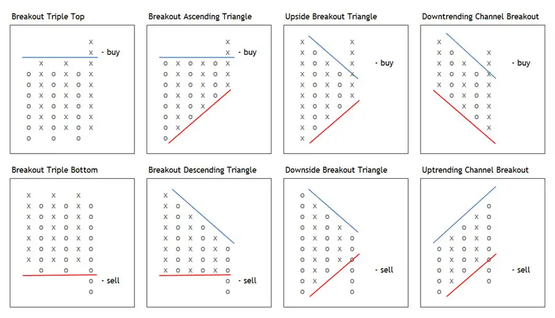
In the picture bellow you can find different stock market situations, when buy or sell signal appears.

Generally, you should buy a stock when the latest X column crosses the previous X column and a sell the stock when the last O column crosses below the previous O column; for example in case of double or triple top or bottom. In some cases, like with symmetric or ascending/descending triangles, a buy or sell signal occurs in the moment when a support or resistance lines are broken. You should consider a buy (sell) signal as stronger if it appears above (bellow) the resistance (support) line.
Recommended Reading - Recommended Reading - Recommended Reading - Recommended Reading
Back To Technical Stock Analysis Index...
Next step: Stock chart patterns tutorial...
Written by: Goran Dolenc
Do you find this content useful? Like! Tweet! Recommend! Share!
Back from Point and Figure to Investing in Stock Market
Back from Point and Figure to Best Online Trading Site for Beginners home page


