Gold Market Price vs. Dow Jones Index
Where is today's gold market price compared to Dow Jones Index from a big picture perspective? We analyzed 110 years of history for you...
This article examines the gold market price and the Dow Jones Industrial average from a big picture perspective, from 1900 to 2010. Let's look at the charts and determine if gold is currently cheap or expensive compared to Dow Jones?
Interested in where the Gold ETF (GLD) price is heading?
Proceed to short and medium term swing trading strategy ideas...
Gold Compared to Dow Jones Index
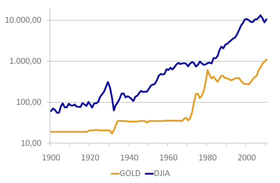
On the first chart nominal gold market price and nominal Dow Jones index price are plotted. Gold went from $19 in 1900 to $1,110 in 2010 (times 58), while DJIA went from $61 in 1900 to $10,500 in 2010 (times 172). The first finding is that stocks investments are obviously more profitable then gold investments on the long-term. While gold average yearly return for the last 110 years was 4.91%, Dow Jones average yearly return was 6.07% in the same period. But there are periods in history, when gold strongly outperformed stocks. Let's move forward.
Dow Jones Index (DJIA) and Gold Nominal Prices
Logarithmic scale, 1900-2010

Gold And Dow Jones Index Adjusted With Inflation
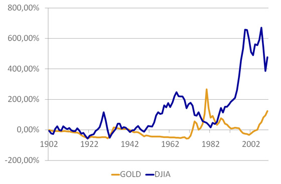
The point of second chart is to show you the difference between nominal and inflation adjusted growth. The thing is that prices of goods and services also rise over time and because of that, the buying power of one dollar today will be less in the future. Gold price did rose 58 times from 1900 to 2010 in nominal terms, but in real-terms, inflation adjusted growth was much lower, only 2.24 times. All the sudden gold investment doesn't look as attractive as it did before. In the same 110 years period from 1900 to 2010 the real growth of Dow Jones Index was times 5.76 (nominally 172).
Dow Jones Index (DJIA) and Gold Inflation Adjusted Cumulative Returns
1900-2010

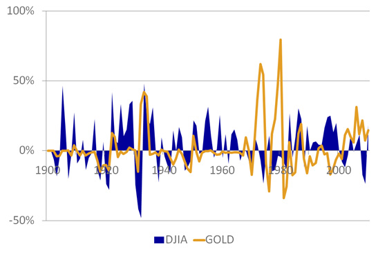
The third chart focuses on Dow Jones Index (DJIA) And Gold Inflation Adjusted Annual Returns; gold scores 1.69% while DJIA scores 3.22% yearly. Another interesting fact can be read from the picture. The orange line, which is representing inflation adjusted gold market price, is mostly bellow the 0% line, meaning, gold growth rarely outperforms inflation; but when it does, it does it extremely. On the other side Dow Jones was a much better inflation hedge in 110 years history and it is not showing such extremes as gold market price.
Dow Jones Index (DJIA) and Gold Inflation Adjusted Annual Returns
1900-2010

Dow/Gold Relative Ratio
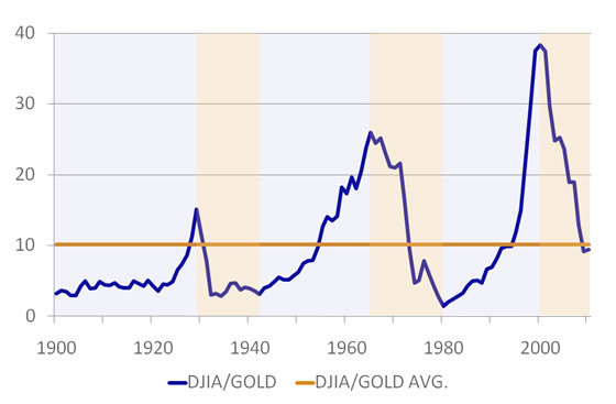
When we take the Dow Jones and divide it by the price of Gold we get an analysis tool called the Dow/Gold Ratio, which is comparing the markets directly and we can see which market is outperforming the other market. When the blue line heads higher, the Dow Jones is performing better, when the blue line heads lower, gold is performing better. In the short term this may not be so clear, but in the long term it can describe a very clear story.
You will notice that Dow Jones is generally outperforming the price of gold. Very approximate conclusion could be that every 20 years of Dow Jones outperforming the price of gold (shaded in light blue) is followed by around 10 years of gold outperforming the Dow Index (shaded in light orange). Average historical Dow/Gold ratio is 10.13. This means that based on historical average it takes 10 ounces of gold to buy one share of the Dow Jones index. At the moment (05-29-2010) currently Dow/Gold ratio is 9.46, which is already below historical average. Will gold market price stop rising at this point? It could, but even more probable is that it will grow a bit more, so that Dow/Gold ratio will touch historical support at around 5, before the cycle will turn around again.
Gold Market Price - Dow/Gold Relative Ratio
1900-2010, Historical Average Is 10, Historical Support Is 5

Written by: Goran Dolenc
Do you find this content useful? Like! Tweet! Recommend! Share!
Back from Gold Market Price to Commodities Market
Back from Gold Market Price to Best Online Trading Site for Beginners home page


